I had never used slack before, but had read a heap of tech articles extolling its virtues. Apparently this is what our current Prime Minister advocates within Cabinet. The upcoming #auunconf organising team set up a channel and invited the participants, so I checked it out. Slack is pretty awesome as far as a unified workspace/messaging protocol can go. What makes it even more awesome, is that someone (@hrbrmstr, no surprise) has made an R package that talks to it.
After installing/loading the slackr package, obtaining an API key (the usual drill; create an app, request key, save it somewhere and pray you don’t lose it or share it) and saving it in ~/.slackr (so I don’t have to remember to delete it from shared code) it was as simple as calling slackr_users() to get a data.frame of the users and their relevant data. Neat!
The only geographical information in there was the timezone, so I figured I would merge that with a shapefile of such and plot it. Here’s the code I ended up creating
Once I had plotted the map I wished the projection was more Pacific-centered, and looked into making that happen. It appears to be trickier than I wanted to bother with for such a small project, so I ended up abandoning it. I did find a stackoverflow answer that seemed to have all the right ingredients (again, @hrbrmstr at work) but I couldn’t get it to plot in any sort of reasonable time.

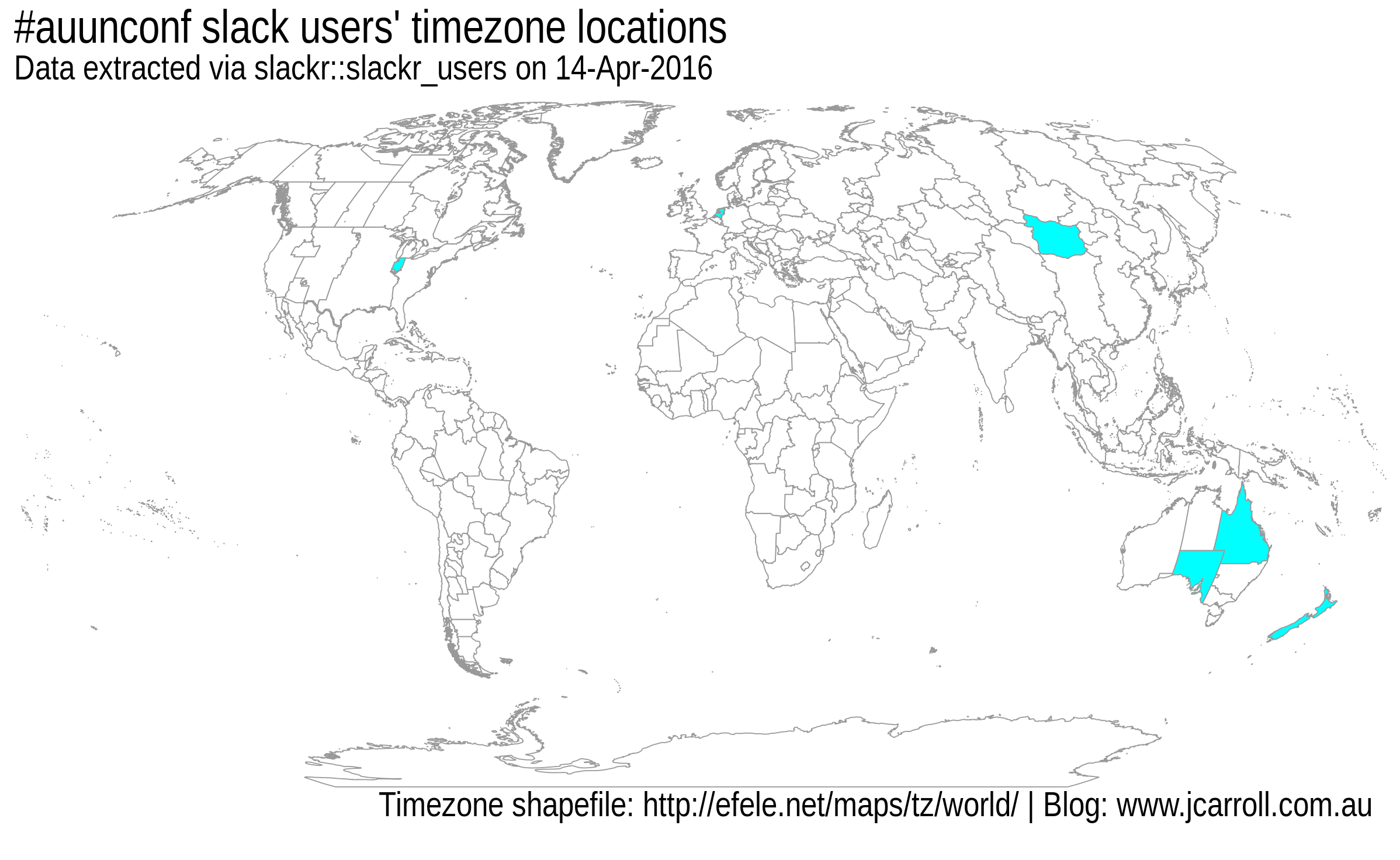
Map of #auunconf slack users
The unique users so far claim to come from:
- Australia/Brisbane
- Australia/Canberra
- Asia/Ulaanbaatar
- America/Indiana/Indianapolis
- Australia/Adelaide
- Europe/Amsterdam
- Pacific/Auckland
so quite the diverse crowd.
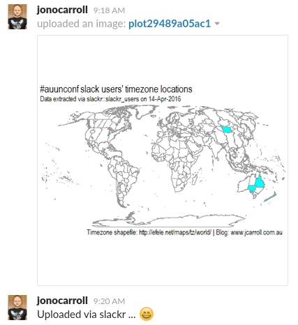
Once all was done and plotted, uploading the image to the slack team was as easy as dev_slackr("#general") which sends the current graphic to the #general channel of the slack team that slackr was configured for. Sure enough, it worked!

It works!
I’m not entirely sure what I’ll use this for, but it was certainly a fun exercise to get working. Perhaps I can generalise it enough to submit a pull-request to make it available in slackr?