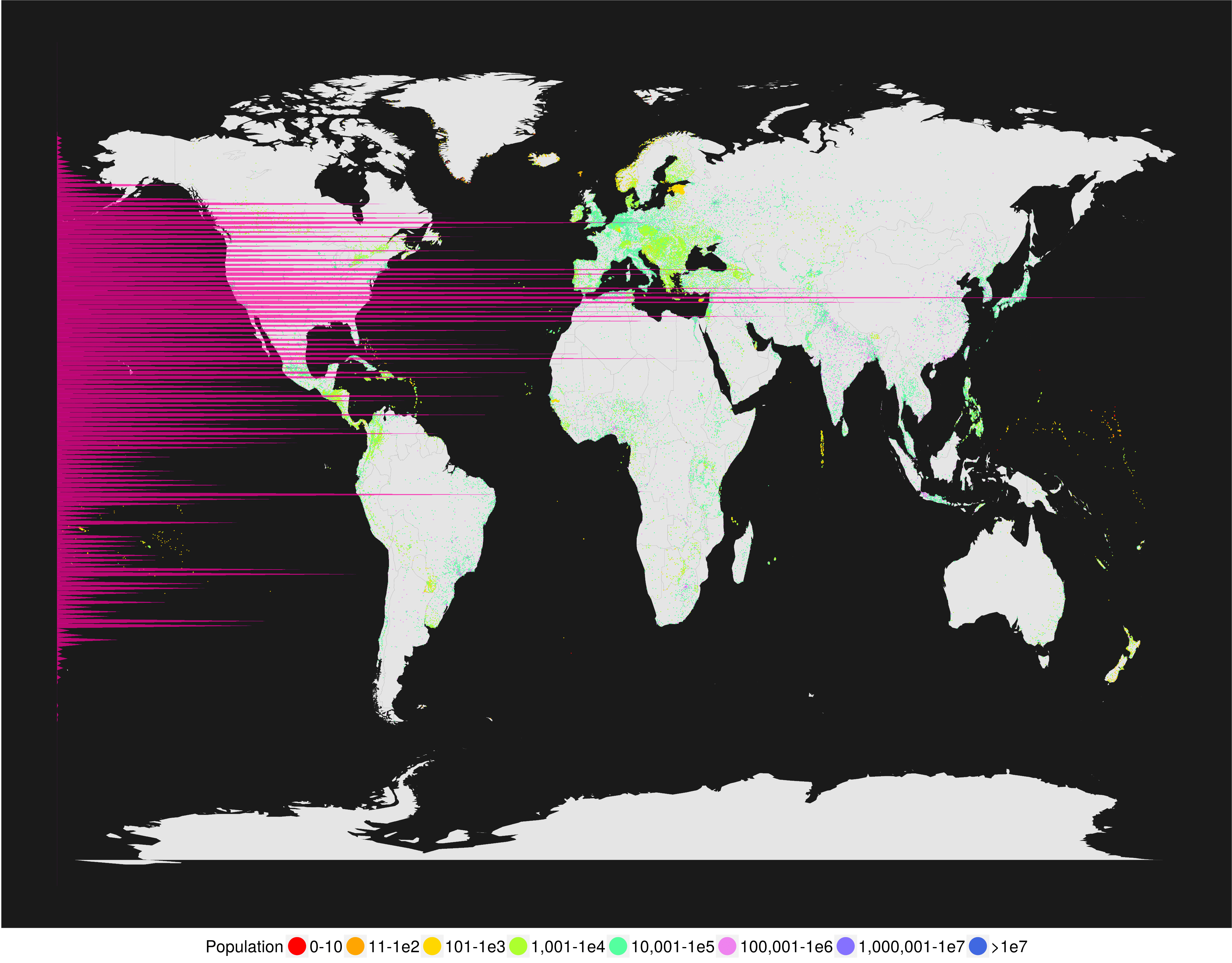
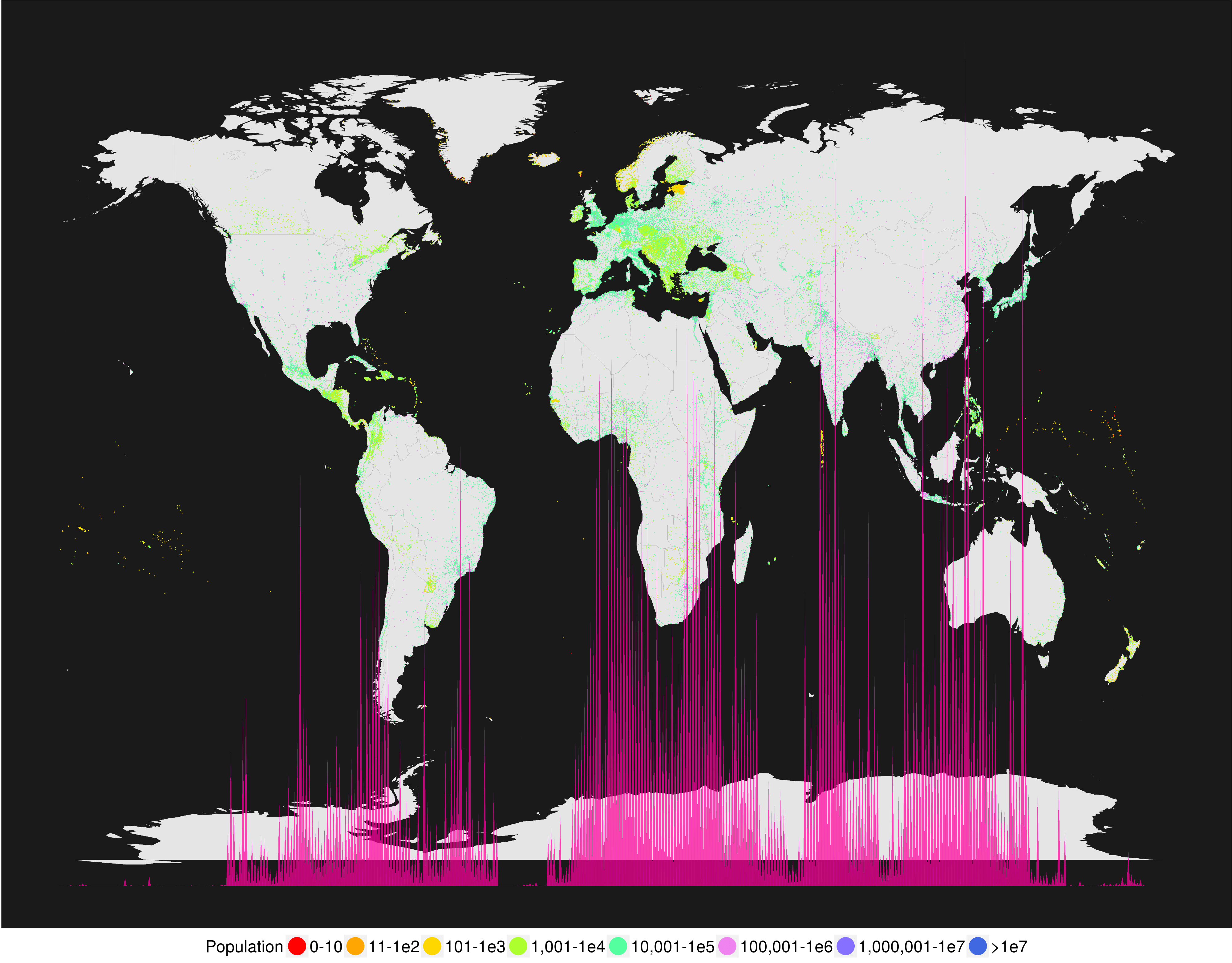
This was a neat graphic that someone made. It shows the population at a given latitude or longitude as a bar chart, overlayed on a map of the world itself. It shows where people live; the bigger the bar, the more people living at that latitude/longitude.
“I can do that.” I said. In R of course. So here it is;
I love that such a small amount of code can produce something so interesting. Click the images below to view them in all their full-size glory.
How is this useful? Well… okay, it’s not. It’s pretty. That’s what it is. An a neat exercise in data manipulation and plotting.
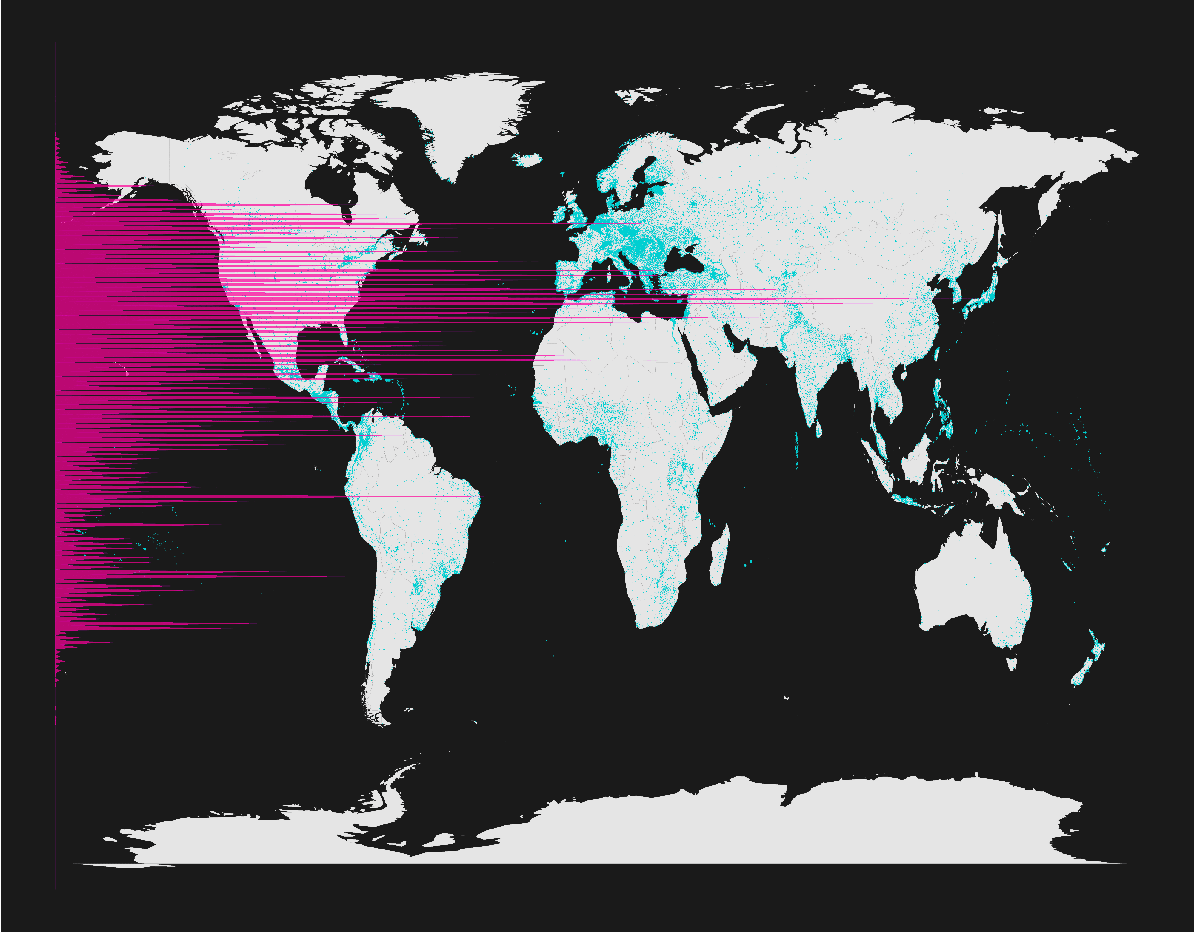
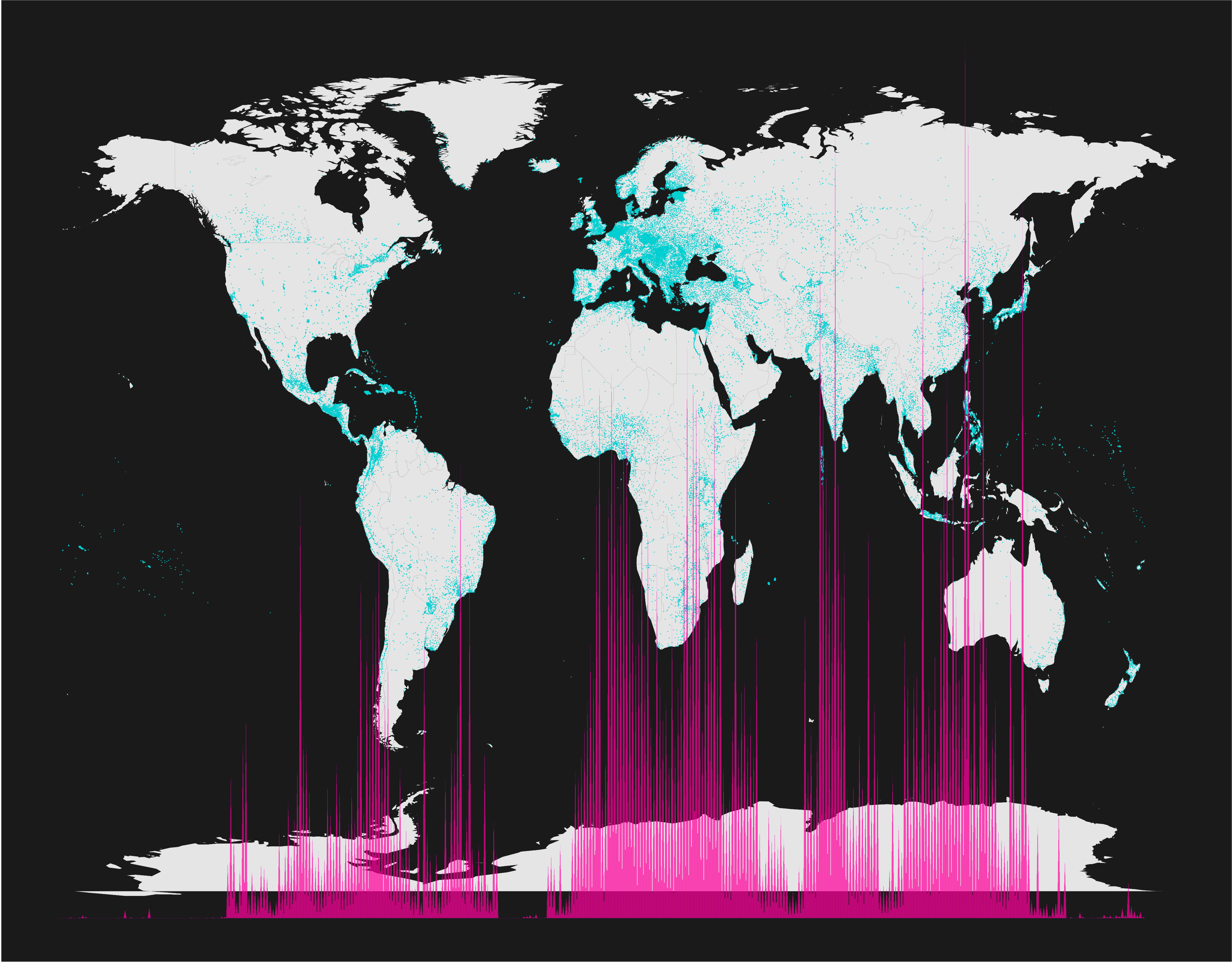
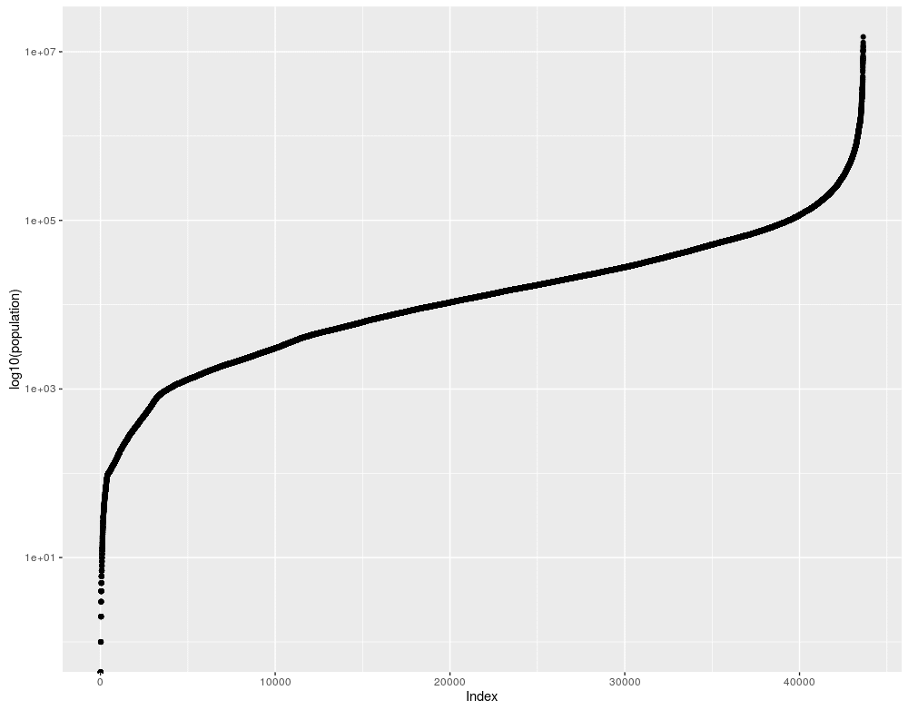
UPDATE: As per a comment on my reddit thread, I’ve updated this to include a logarithmic colour-scale for population. The populations follow a nice logit curve if you arrange them in order:
Here’s the updated graphics: