From Bob Rudis’ blog comes a weekly data/coding challenge. I didn’t quite get the time to tackle last week’s but I thought this one offered up a pretty good opportunity.
Half the challenge is of course data processing/tidying, which is a big part of data science anyway (“75% of data science is getting the data in the right format, the other 50% is doing something with it” in case you haven’t heard the old joke). Needless to say, I’m using R for this one.
In case folks are wondering why I’m doing this, it’s pretty simple. We need a society that has high data literacy and we need folks who are capable of making awesome, truthful data visualizations. The only way to do that is by working with data over, and over, and over, and over again.
Directed projects with some reward are one of the best Pavlovian ways to accomplish that :-)
The data this week is from the U.S. Department of Housing and Urban Development and involves homeless statistics, which I guess is pretty confronting given that I’ve done all this work from the comfort of my warm bed. Back to the topic at hand though. Bob Rudis provided some sample code and a nice facet_wrapped lollipop graph. I’ve also gone the ggplot2 route but I’ve done mine as a choropleth with Bob Rudis’ neat extensions for USA projections. It’s an almost too-obvious choice, so I spruced it up with the gganimate package. The script is here:
The map shows states with the median homeless population per thousand state population as white, with more than that coloured red, less than the median coloured blue (no, it’s not a political map). Each frame shows a different year of data. I think it does an okay job of displaying the changes in this statistic over a few years.
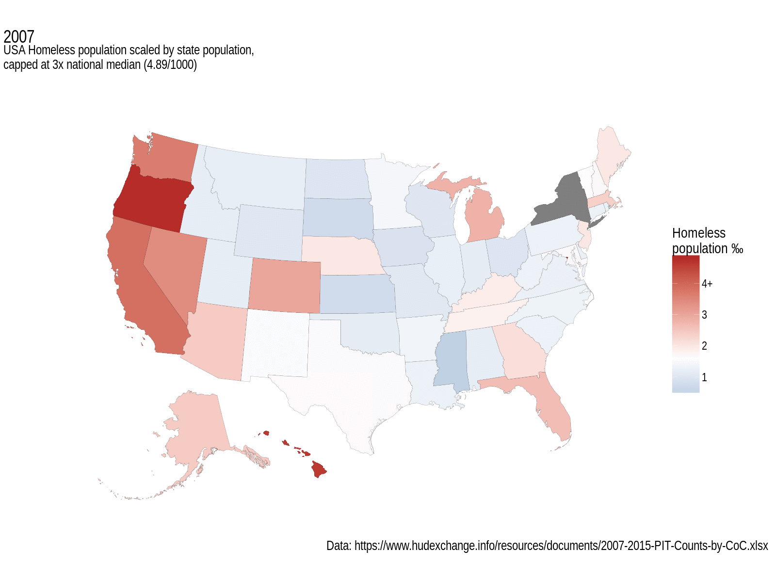
USA Homeless population, scaled by state population, and capped at 3x the national median. White fill represents median values. Grey states didn’t have data for that year.
I’m loving the annotations extensions to ggplot2; they really make these graphs a lot more professional looking. As for interpreting this map, well, that’s perhaps a little trickier. It seems to look like things got a bit worse overall in the earlier years of this data set, but since then they’ve been getting better. The west coast still has a large homeless population, and the central states seem to be a lot better. What’s not obvious from this, and that’s a general failing of non-size-proportional maps, is that some of the smallest states have some of the biggest per mille homelessness rates; D.C. tops out the scale in every year at between 9.3‰ (2007) and 11.7‰ (2014), followed by Oregon and Hawaii who see more than 3x the national median for more than a couple of years.
I’m now somewhat curious to see what the Australian version looks like. Perhaps that’s a topic for the upcoming ROpenSci #auunconf.
As always, comments and suggestions welcome. The full repo of files is available here, for which I’ll be adding a pull-request back into the original repo.