Open-source software is awesome. If I found that a piece of closed-source software was missing a feature that I wanted, well, bad luck. I probably couldn’t even tell if was actually missing or if I just didn’t know about it. When the source is available, maintained, and documented however, things get fun. We can identify, and perhaps fill gaps.
I’ve thought for a couple of projects which had bar-graphs that it would be neat to have the categories labelled by an icon or a picture. Say, the logo for a company or an illustrative example. Sure, you could fire up GIMP/Inkscape and manually insert them over the top of the text labels (each and every time you re-produce the graph… no thanks) but that’s not how I operate.
There are probably very few cases for which this is technically a good idea (trying to be a featured author on JunkCharts might very well be one of those reasons). Nonetheless, there are at least a couple of requests for this floating around on stackoverflow; here and here for example. I struggled to find any satisfactory solutions that were in current working order (though perhaps my Google-fu has failed me).
The second link there has a working example, but the big update to ggplot2 breaks that pretty strongly; opts was deprecated and now element_text() has a gatekeeper validation routine that prevents any such messing around. The first link however takes a different route. I couldn’t get that one to work either, but in any case the answer is a year out of date (updates in ggplot2 can easily have broken the gTree relations), not particularly flexible, and relies on saving intermittent image files for PostScriptTrace to read back in which I’m not a fan of (and couldn’t get to work anyway).
I decided that I perhaps had enough ammunition to hack something together myself (emphasis on hack), and sure enough it seems to have worked (for a limited definition of “worked” with no attached or implied guarantees whatsoever).
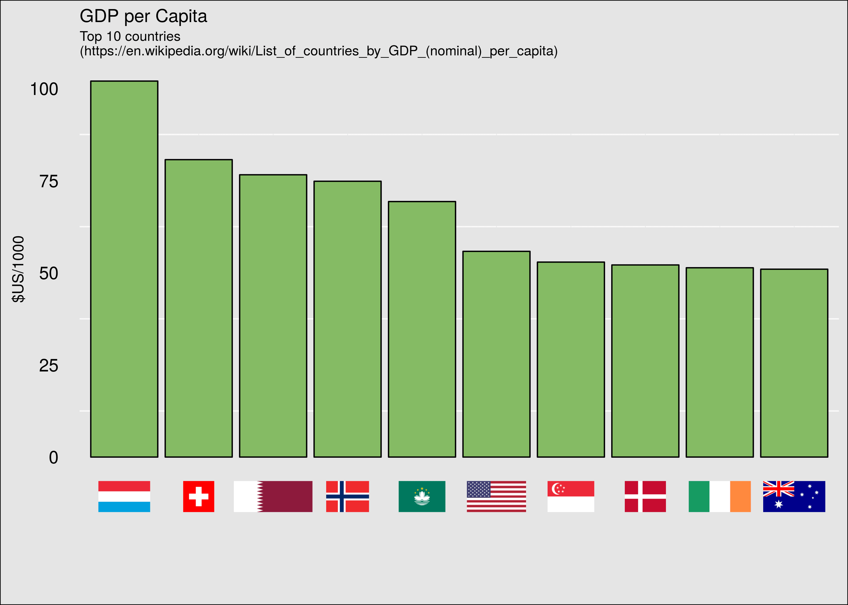
GDP per capita with flags for x-axis labels. This was harder to make than it seemed, but I’ve since added a little more flexibility to it.
- Stop and carefully re-evaluate the choices that you’ve made to bring you to this decision. Are you sure? Okay…
-
Save the images (in the correct factor order) into a list (e.g.
pics). -
Build your bar graph with categorical x-axis as per normal, using
theme()to remove the labels. Save as an object (e.g.g). - Source the function from this gist (at your own risk… copy and paste if you prefer):
-
Call (or pipe your
ggplotobject to) the function: - Your image will be re-drawn with your pictures labelling the categories.
devtools::source_gist("1d1bdb00a7b3910d62bf3eec8a77b4a7")g %>% add_images_as_xlabels(pics)
## or
add_images_as_xlabels(g, pics)Here’s an example of the code used to generate the GDP per capita image, featuring some fairly brief (for what it does) rvest scraping (to reiterate; I don’t want to have to do any of this by hand, so let’s code it up!).
-
I’m not sure how to put the x-axis title back in at the right position without padding it with a lot of linebreaks (
"\n\n\n\nX-AXIS TITLE"). -
I’m not sure how to move the
captionline fromlabs()(assuming you’re using the development version ofggplot2on GitHub with @hrbrmstr’s excellent annotation additions) so it potentially gets drawn over. - The spacing below the graph is currently arbitrarily set to a few lines more than necessary, but it’s a compromise in having an arbitrary number of images loaded at their correct sizes.
- Similarly, I’ve just expanded the plot range of the original graph by a seemingly okay amount which has worked for the few examples I’ve tried.
- Using a graph like this places the onus of domain knowledge onto the reader; if you don’t know what those flags refer to then this graph is less useful than one with the countries labelled with words. Prettier though.
I’ve no doubt that there must be a better way to do this, but it’s beyond my understanding of how ggproto works, and I can’t seem to bypass element_text’s requirements with what I do know. If you would like to help develop this into something more robust then I’m most interested. Given that it’s a single function I wasn’t going to create a package just for this, but I’m willing to help incorporate it into someone’s existing package. Hit the comments or ping me on Twitter ([@carroll_jono](https://twitter.com/carroll_jono))!