They say “if you want to find an answer on the internet, just present a wrong one as fact. Then wait.”
It didn’t take long, actually. Despite my searches while trying to get images into x-axis labels it seems I overlooked a working, significantly less hacky implementation. My Google-fu had in fact let me down.
Baptiste Auguié ([@tpab](https://twitter.com/tpab) / [@baptiste](https://github.com/baptiste)) had this working a while ago (seemingly before the ggplot2 update that broke other methods), and in a definitively less hacky way. I’ve added a new gist (if you’re reading this on R-bloggers, the gist isn’t embedded, so either follow the link or view on my site) which implements it on the same graph as earlier, and I like this significantly more.
{{% gist jonocarroll 2f9490f1f5e7c82ef8b791a4b91fc9ca %}}
This method gets around theelement_text() validation and updates the grobs in a way that’s above my pay grade/understanding of ggplot2 internals, and is a much more consistent way to go about it. This also:
- places the factor labels on the graph along with the picture, covering some concerns about people not knowing which maps are for which country,
-
leaves room for the
captionto go back in, which I wanted, - automatically scales the grob better,
-
doesn’t involve creating an external
groband thus turning off clipping; usingaxis.text.xis exactly what I was hoping for.
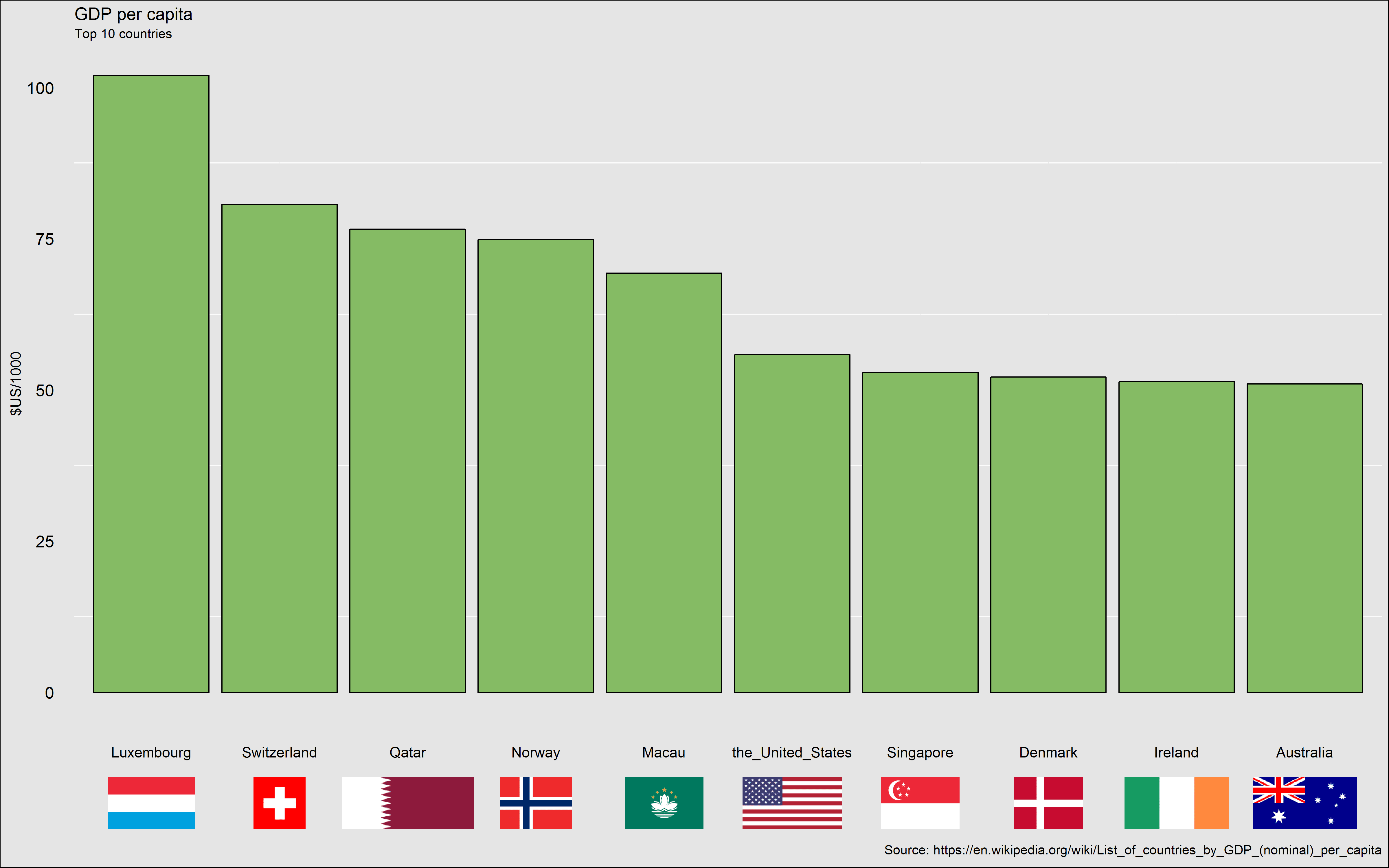
Updated version using @baptiste’s method; much better.
My version worked (sort of) but only because it used options that were bad practice (not doubting that for a moment). I’d like to see this method make it into ggplot2 properly; Baptiste had an open GitHub issue involving it a while ago but it has since been closed, presumably without the feature being incorporated.
I started the previous post by saying how awesome open-source software is (e.g. R). You know what else is awesome? The #rstats community. Thank you to every one of you.