I mapped out the USA homelessness rate in my last post as a challenge and noted at the end that it would be interesting to do the same for Australia. That was the first comment I received in person, too. “Let’s do it!” I said. What I found may shock you (click-bait title; check).
Most of the code carried over. Of course, lacking hrbrmstr’s neat albersusa equivalent I had to obtain and process the shapefile myself. Thankfully, the ABS have me covered. Here’s the whole script;
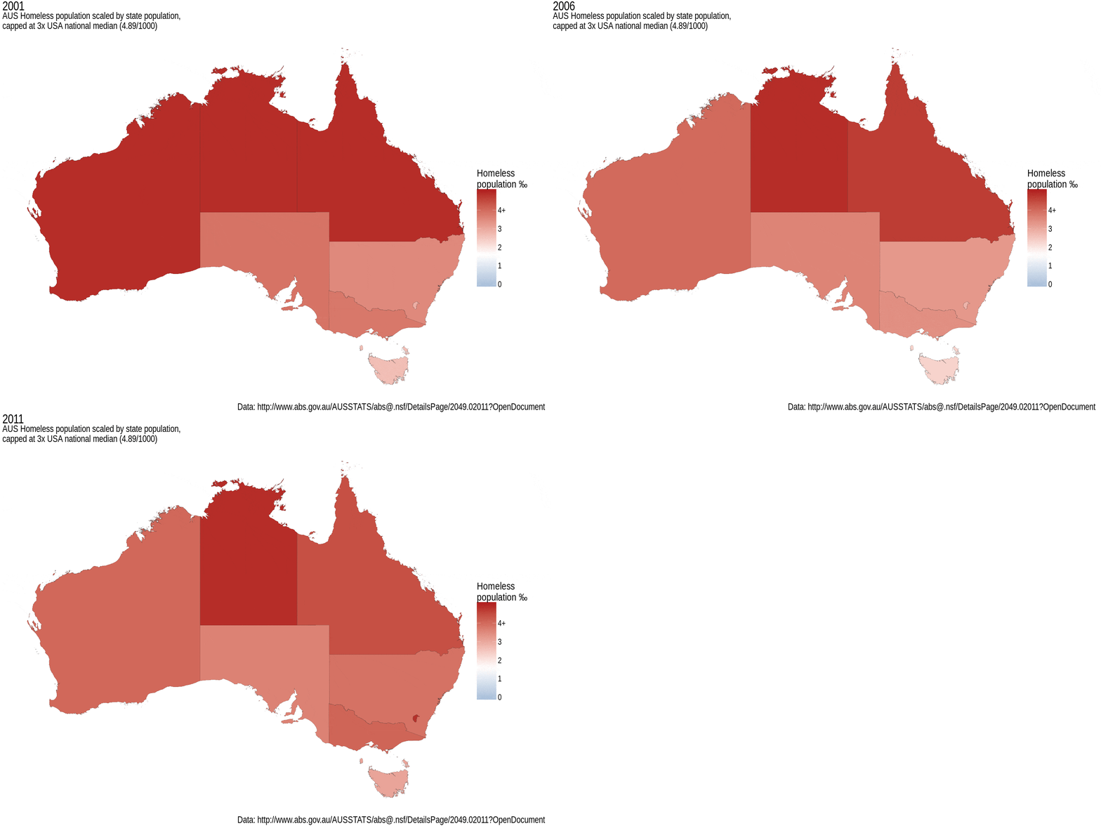
For starters, I compared the Australian statistics on the same scale as the USA (median 1.63‰, capped at 3x that value) and was shocked

AUS homeless population, US scale
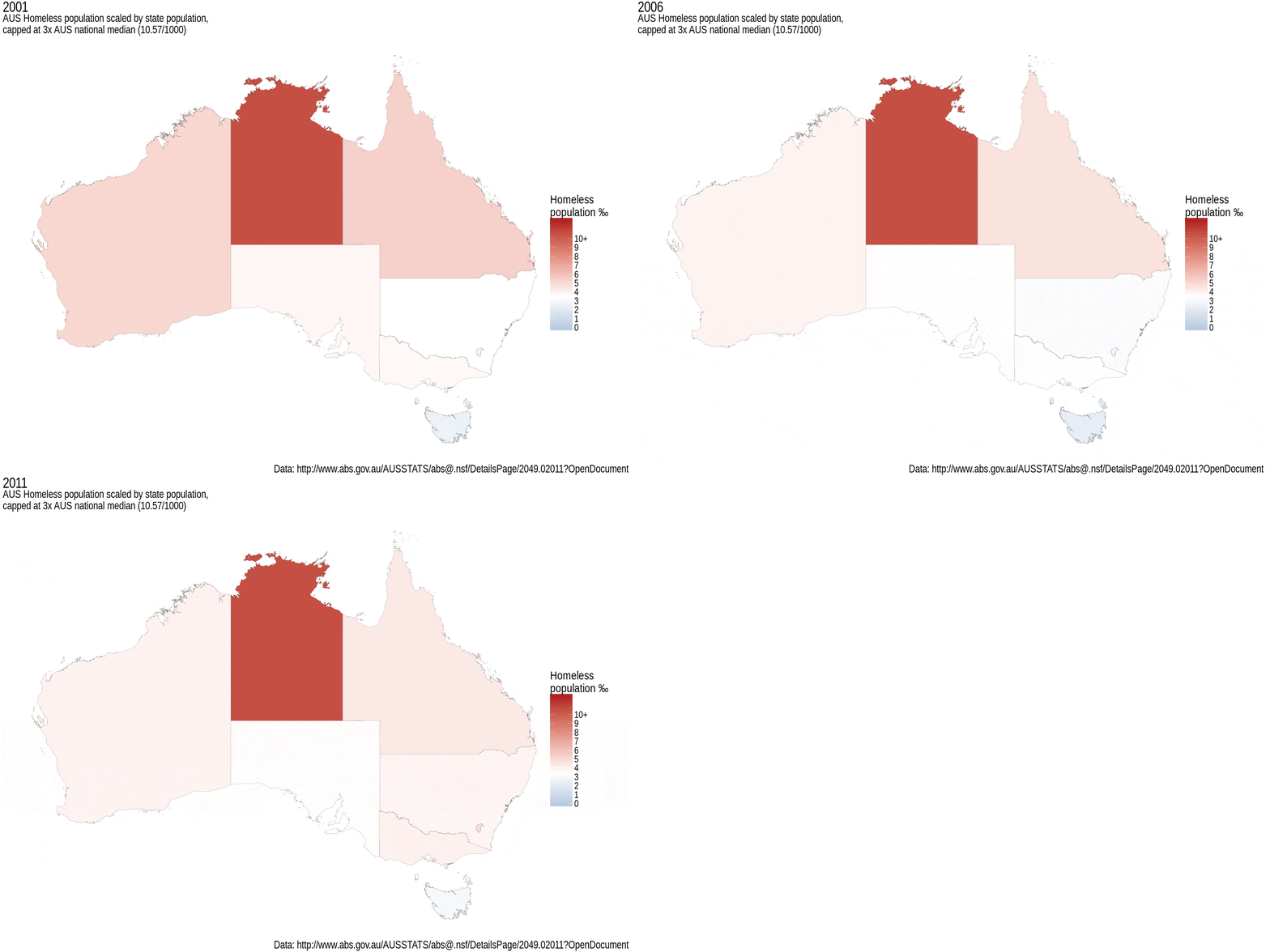
Yep, it appears we’re worse than the USA for homelessness. That sucks. What if we put it back on our own scale, how do our states do relatively? Well, for starters, the median goes up to 3.5‰ (I’ve again capped at 3x that value) but a lot of that seems to be coming from NT. Looking at the data itself, our lowest value is indeed higher than the USA median, so we’ve nothing to be proud of. That said, some states are doing better than our own median. TAS looks to be nicely below, while SA seems to be sitting around the median.

AUS homeless population, AUS scale
If we drill down to the data itself, we can see what the actual figures look like. I’ve had a go at hrbrmstr’s geom_lollipop (from the dev version of ggalt) and it works nicely, as expected. I’ve left NT off this first graph so that the others stand a fighting chance at the scale.

And here’s what happens if you include the Northern Territory

Ouch. It looks odd, but it’s correct. The number of people in the NT in 2011 was around 231,331 but the census-estimated homeless population was 15,479, which means that 6.7% of the population (i.e. 67‰) were homeless. What? Have I made a mistake? No, it’s just horrifyingly true.
Aw, man. I came here for data analysis, not feels. Clearly this is a national shame, and something needs to be done about it.